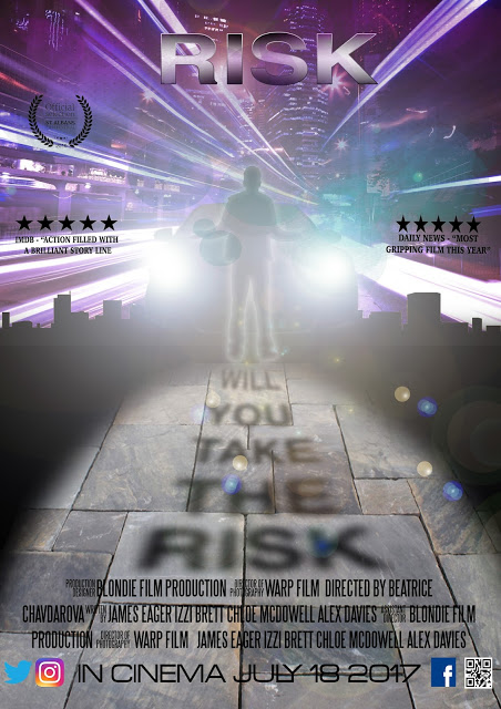
A striking and dynamic design that is eye-catching and forms a cohesive fit with both the poster design and the film trailer. The layout shows solid understanding of genre conventions (masthead, main splash, coverlines, puff, exclusive, QR code, bar code/ price/date). The 3D quality draws in the audience and positions us behind the driving seat of the car that features in the trailer as one of the 'risks' that the students in the medical trial is forced to face, when one is nearly run down by a car. This incident features on the poster. It is alluded to rather than fully filmed in the trailer (risk assessment issues!). The colour design is particularly effective, recreating car headlights against the neon cityscape.

A striking and dynamic design that is eye-catching and forms a cohesive fit with both the poster design and the film trailer. The layout shows solid understanding of genre conventions (masthead, main splash, coverlines, puff, exclusive, QR code, bar code/ price/date). The 3D quality draws in the audience and positions us behind the driving seat of the car that features in the trailer as one of the 'risks' that the students in the medical trial is forced to face, when one is nearly run down by a car. This incident features on the poster. It is alluded to rather than fully filmed in the trailer (risk assessment issues!). The colour design is particularly effective, recreating car headlights against the neon cityscape.
ReplyDelete