I worked with Chloe McDowell 1377, Beatrice Chavdarova 1309, Alex Davies 1313
I chose to make a trailer entitled, "RISK"
I have chosen Brief 2. A promotion package for a new film, to include a trailer, together with the following two options:
I have made a film magazine front cover, featuring the film "RISK"
I have also made a poster for the film.
My evaluation questions are above.
I have taken charge on editing the film in Adobe After effects, along with this I have self directed all of the scenes that I have acted in such as: Tennis scene while I receive the text, myself running up to the belvedere. Also I have filmed one scene where Alex is receiving a text. Finally, I have taken charge of the groups Facebook page and taking charge of keeping that up to date.
I was in charge of editing the film trailer for our group and I decided to use Adobe After Effects to edit the film so that I can add in necessary special effects easily.
Firstly, I decided to come up with a way how I can portray the text coming along the screen. I decided to make it look like a type writer which would suit the theme of a text message being written. I did this by creating the text 'RISK' and adding a mask to the layer, then adding a keyframe at the start which wouldn't reveal any of the text, then add in another keyframe in a few seconds later where I would want the text to appear and therefore the mask would slowly move across the screen revealing the text. To make it look like a type writer, I added a blinker where every few frames I would set the opacity from 0 to 100 to make it look like its flashing and then make it copy the same mask as the text to replicate the movement (known as parenting the layer)
In the opening scene with the doctor I decided to change the colour tone of the scene to create the sense of danger in the scene indicating to the audience that this is the evil doctor who is controlling the students. I got the light shade of red in the scene by adding the effect 'Level' which allows me to change the level of red, green and blue (RGB) in the clip, I made the green and blue reduced and then added the effect 'Tritone' which would give me the overlay of the colour and allow me to blend the red with the original colours of the scene.
Another challenge I faced was adding in the texts to the scene. This was because i needed to make it look like a text on the screen and clear enough to read. I did this by creating a new 'Null object layer' which can be used to track motion. Then I would go back to the main clip and add a new motion where it would track the phone and give me all the keyframes of the position to follow the phone which would be parented to the Null object. After this, I put the text box in the scene and parented it with the Null object so that it would follow the phone around whenever the phone was moved, thus giving it the effect that the text was coming from the phone.
The most challenging part was adding the glitch effects into the clips. This was because I had to make a new composition with the clip. I started by using the glitch preset that I have which is just a blank layer which distorts the main film clip and makes it move which I would parent with the clip so that the clip moves along with the other layer. To add depth to the glitch I duplicated three layers making one Red, Green and Blue and adding a screen effect to the red and blue layer returning the blending of the 3 layers to white. This then allowed me to add an 'Adjustment layer' which can be used to split the 3 layers by adding the effect 'Split' where the 3 layers would move apart in the same distorted way which could either increase or decrease by changing the value of how much they split. This then gave me the glitch effect that I wanted. Finally, to add more a distortion, I added the effect 'Bad TV -3' which gave me the blur across the image or text giving it a static effect which i can change the position of it within the clip using different masks at different times of the scene.
Here is what a final edit of the trailer looked like in after effects while I was editing.
This is what the final edit looked like with just the layers showing. Each colour block shows an indication of each scene that is in the trailer, along with the long blocks which are the music.
Once I rendered and saved the film in after effects and got the file, I decided to go into Adobe Premier Pro where I could refine the edit a bit more by changing some of the sounds and adding in more of the glitch sound effects. This is because its easier to work with sounds in film on Premier Pro compared to After effects which would overall save me time along with making it easier to work with.
After this the edit was done and can be watched here:
I have been making my film poster on Photoshop for our movie, 'Risk'
This is the final stage of the poster in photoshop
The poster was made at this point and needed to add the bottom credits of the film along with the social media images and release dates. The posters overall colour was quite dark so I decided to add the effect 'Lens flare' to increase the intensity of the headlights and the overall brightness.
The overall layout was done for the poster with all the pieces put together on the bottom half of the poster so it gives the shadow effect on the text.
After I had sorted out the main components of the poster; the text, man and the car. I was able to work around them and add things which suited each component.
This was the first stage of making the poster which was to identify which would be the main focus of the poster which was the car, character and the slogan of the film. Therefore it was crucial to get them right and looking the best.
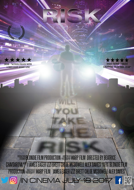
FILM TITLE: Is prominently positioned at the top centre and its mirror image contains the tagline, making an intriguing shadow. The FONT is bold, smooth, modern and metallic coloured, with futuristic features. CENTRAL IMAGE features one of the main protagonists out at night with his hands spread out wide as he gazes at the city. He stands in the glare of the headlights of an oncoming car, clearly a very dangerous risk to take. The thriller GENRE is therefore made clear to the viewer. In the trailer, we learn that a group of young people have been drugged in a scientific test and are now being controlled by the doctor involved. They are issued certain challenges which involve risk, hence the title Risk. The image in the poster depicts one of the protagonists at the point when they are about to launch them self into one of the challenges they face. That is why this poster has the sense of danger conveyed by the night-time theme and the city environment. COLOURS are key to suggesting the thrills and the danger, such as the bright colours with a lot going on which can relate to the protagonists with the many dangers they would have to face. The TAGLINE provides the ANCHORAGE: "Will you take the risk" shows the dangers and challenges. Therefore, this would make it easier for audiences to know what genre our film would be.
BILLING BLOCK: The billing block in my film is used to have a list of the people that are involved with the film such as listing all the people in my group and the roles that they played in making the trailer. Such as showing which people directed the film along with with the people who were stared in the film.
SOCIAL MEDIA & WEBSITE:At the bottom of the poster it has the pictures of the social media platforms that our trailer would use, such as Facebook, Twitter, Instagram and a QR code which would be linked back to my blog. The use of the social media links on the poster would allow the audience to keep track of whats going on with the film.
DATE OF RELEASE: The release date of the film is at the bottom of the poster in big writing so that its clear to the audience who see the poster would know when the film would be release and keep up to date with the social media of the film up until the date.
AWARDS: Finally, the awards on the poster is the 'Official selection st albans film festive' along with other film reviews from 'IMDB' and 'Daily news' This is good because it allows the audiences to see if the film would be worth seeing depending on the reviews that its received.
After receiving feedback on my film poster, I decided to make a few changes to it based on what people thought about it. From this feedback, I changed the alignment of the text on the sides to make both in line with each other and straight rather than at an angle.
Secondly, from the feedback, I agreed that my title was too small so I decided to make it larger so it would stand out more and mirror the same word depicted in shadow below it.
Finally, in the billing block I got rid of the inverted commas around people's name so that it would look more professional.
I received a lot of positive feedback: The composition of my graphic design was very much admired for its dynamic qualities with the center of visual attention being the protagonist who is being challenged to take risks. The focus group admired the colour scheme which they felt connoted the riskiness of the narrative with its startling and enervating electronic and neon hues which are very disconcerting. It was felt that the colours suggested the dangers of the city at night, with the car headlights focused on the protagonist. In particular, the way that they tagline was created in shadows was felt to be very ominous and in keeping with the spirit of the film. It was still felt that the pull quotes from IMDB and Daily News were too big in size.


